
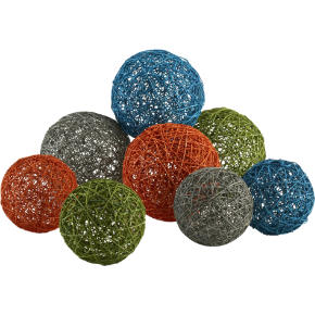
 I am really drawn to these balls by CB2. [Yes, jerks, insert your "Well, Casey's always drawn to balls" joke here. Then grow up.] [Okay, I admit it, I still mentally make ball jokes. Someday I'll be an adult.] Anyway, the balls pretty much match my living room color scheme. I can picture a bowl or hurricane lamp full of them. I'm usually not a huge fan of these sorts of things, but I guess there's a kindergarten/yarn/plaster of Paris aspect to them that I like. While I'm on the subject of CB2, let me say that you should definitely visit their page. They are very reasonable about
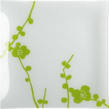 incredibly well-designed pieces. I covet the haiku platter. Sadly, I am destined to years of retro-red, as dictated by my kitchen.
I think this brings me to another subject. I'm really wondering: Are other people as crazy as I am?? So, I have this 1950s-ish kitchen. I like it. I put in the Pottery Barn cafe curtains, and I have a bunch of old (and, frankly, slightly bizarre) family pictures up, and Fiestaware galore, and I'm happy with it. I'm also sort of stuck with it. I feel as if every item I buy for the kitchen must be red. I don't even really like red. And really, I should let go.
 Take the aforementioned haiku platter, for example. It's a platter. As in, take an appetizer to a party. As in, take an appetizer to a party given by people (ahem, usually your mom) who most likely do not have a 1950s-inspired kitchen. As in, these theoretical people will love your appetizer and compliment you on your cute haiku platter which will lead to a discussion of CB2 which will lead to a discussion of your blog and maybe you'll finally get readers. Now, I know I should buy the darn platter. But I JUST CAN'T DO IT. I can't buy something that doesn't match the kitchen. Do you want to know why? Promise not to laugh? Okay. Because my cupboards won't match. I know, I know, I'm insane. It's not like they're glass-front or anything. Nope. It's just that I'll know. I wonder if there's a program for people like me.
What else, what else? Ah...I recently discovered Textile Arts. They've got a limited but cute assortment of gifts, as well as large-print Marimekko fabric, like the oilcloth piece below. I am, I must say, a little sad that I haven't been able to work this color a

3 comments:
I think you can get away with the milky white in vases and things for an accent in what sounds like such a colorful house, The blue might even work in very small, bright amounts.
I can incorporate the white ones in my bedroom, which is mostly white anyway. The living room, though, is a no pastel blue zone. It's got reds and golds, which I am reasonably sure will clash with blue like nobody's business. Ah well. Next house.
Clarification: my boyfriend just called to tell me that I can't claim to only make balls jokes in my head. Touche.
Post a Comment